Company rebrand and positioning
Watch our video
Project Overview
Horner Recruitment’s logo was 10 years old and the Horner team felt it no longer represented the culture and vision of the company. While Horner suspected they needed a new brand identity, they were duly cautious as the brand was well established and known within the recruitment industry.
To give Brand clarity and Marketing confidence, BEAM recommended a two-pronged Strategic Review:
1. Competitive Market Review to assess both Horner’s brand as well as their Competitors. This included review of all brand’s, key messages and points of difference. A review of their competitor’s digital performance was also conducted to assess online strategies and tactics.
2. Customer Survey to establish the current brand’s appeal and perceptions.
The results of the Strategic Review revealed opportunities for positionings, key messages, and most importantly ways to convey a point of difference. The survey revealed substantial concerns with the current logo and the need for a new brand identity.
SYMBOL
New Brand
BEAM’s team provided several brand design options for consideration – each providing alternative brand strategies and strengths. While two particular designs resonated successfully with the Horner team, the ultimate decision was effectively chosen by the results of further consumer research. The wining logo had a resounding 80% preference which gave the Horner team complete brand confidence.
Brand Positioning
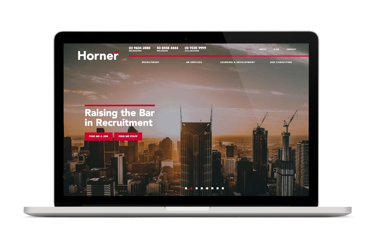
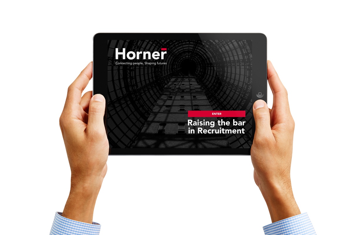
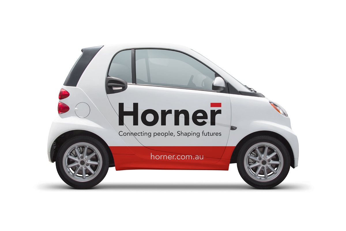
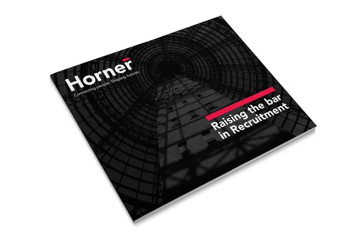
The new Horner logo portrays the personality of the team’s passion for quality recruitment – with the red bar not only giving a modern feel but reinforcing the promotional tagline – ‘Raising the Bar in Recruitment’. The colours of black and red, while reinforcing the brand of old, inject a fresh modern feel.
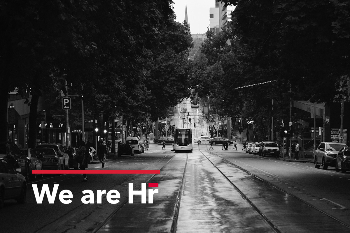
The new positioning of Melbourne Recruitment Specialists provides further interest and a point of difference that is visually reinforced with exceptional and iconic images of Melbourne throughout all branding and its collateral.
Key Deliverables
- Competitor Analysis
- Consumer Research - to test current logo and proposed new logos
- Brand Identity – design concepts and refinement of final logo
- Brand extensions with key visuals of Melbourne
- Key Message Development & Copy for website sliders & campaigns
- Promotional Tagline development – “Raising the Bar in Recruitment”
- E-brochure - Sales tool including copy, design, logistics & development
